
The 13th century Japanese waka poetry anthology, the Ogura Hyakkunin Isshu has been translated many times. Each translation is slightly different in its interpretation of semantics and handling of literary devices. These specific differences can be hard to track as it requires a careful reading of both the source text, and its various translations. Moreover, visual representations of textual data are currently limited.
Projects
A Comparative Mapping of Translation in Poetry

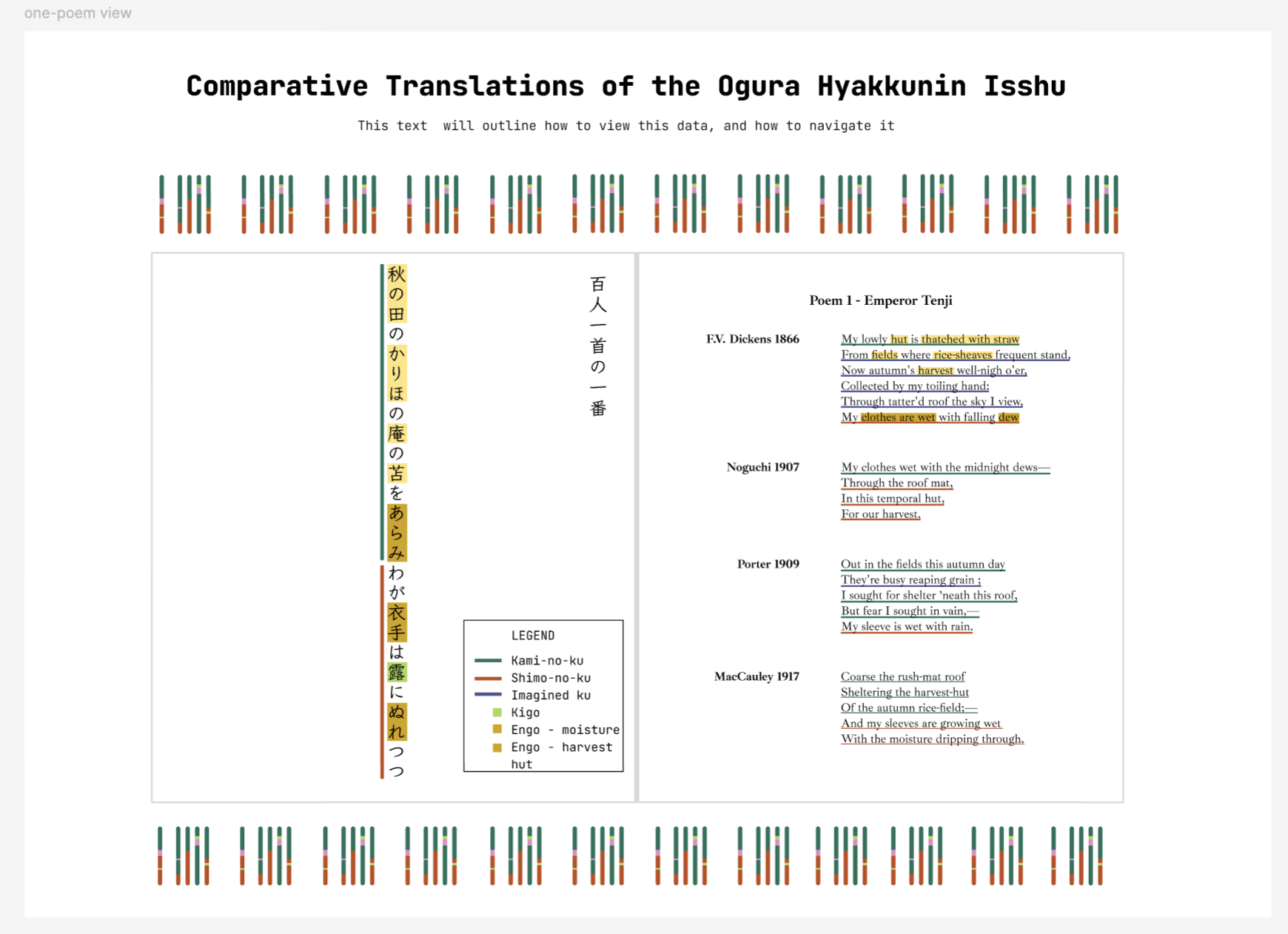
An interactive data dashboard exploring translation patterns across four public-domain English translations of a 13th-century Japanese waka poetry anthology, visualized through a genomics-inspired encoding.
Visit live site →
Project Background
Project Goal
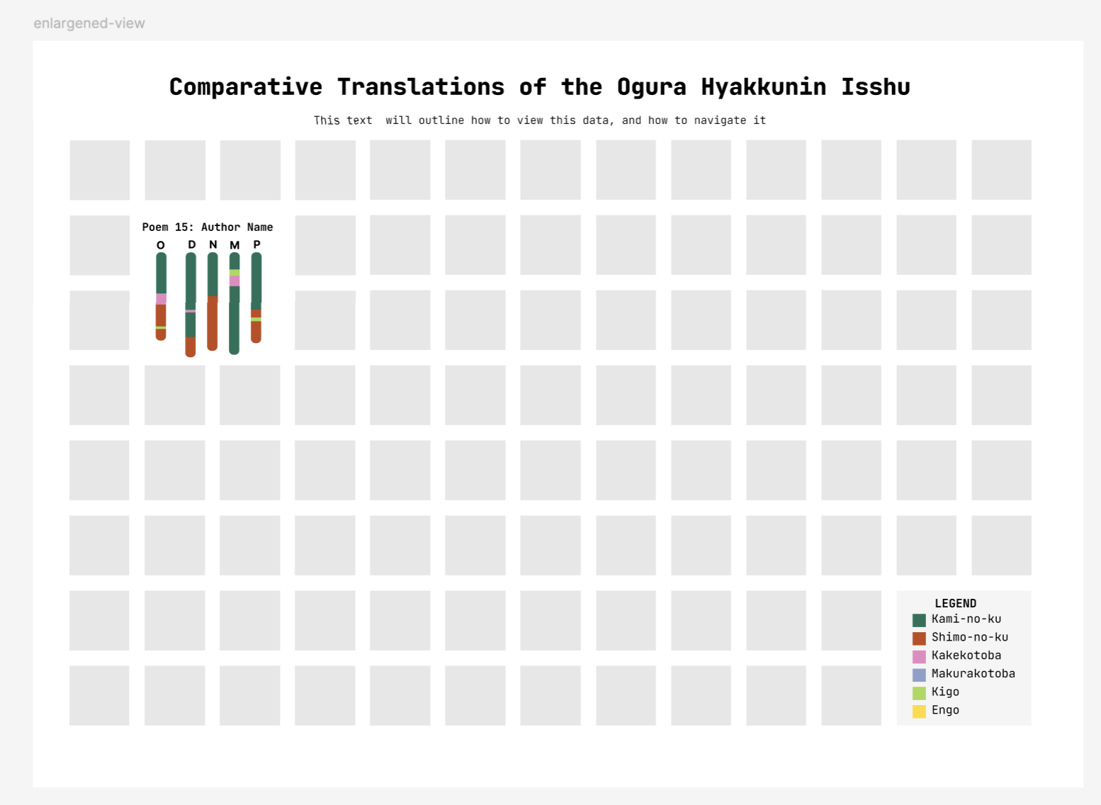
Develop an interactive data dashboard to explore and view patterns within the poetry anthology at both a high level, and details-view.
Process Documentation
Motivating Idea
This project was inspired by a curiosity for how we can better support understanding and visualizing comparative translations (the study of contrasting translations of the same work in terms of strategy and outcome, side by side). It focuses on how visualization specifically can be used to encourage this understanding.
Gathering & Cleaning the Data
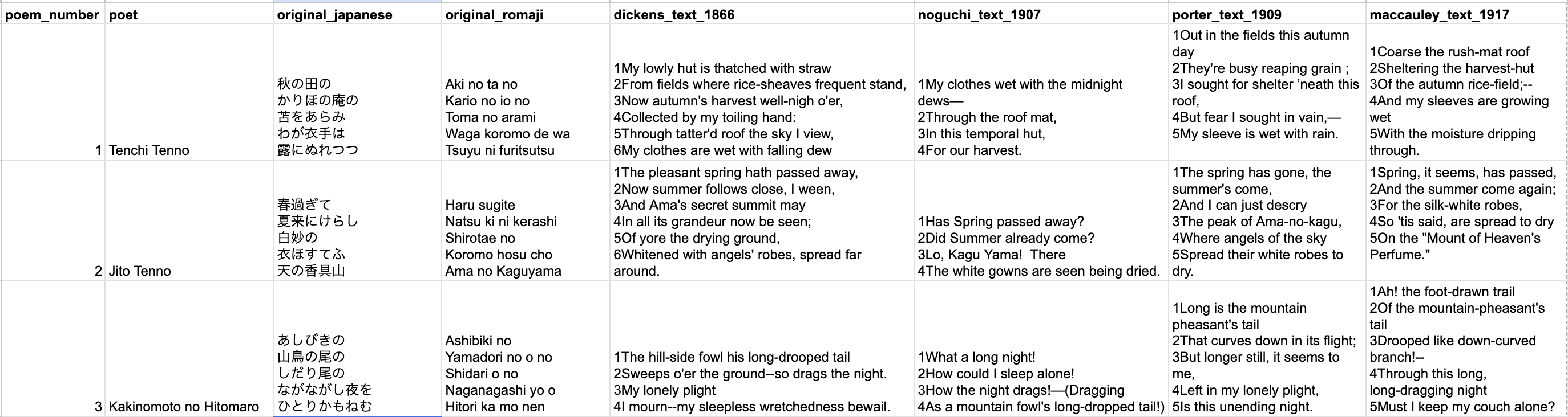
After deciding to analyze the OHI, I looked for translations of the Ogura Hyakyunin Isshu that were in the public domain and settled on four translators (all published before 1920). I gathered the data in a spreadsheet poem by poem while I got a first glance at the differences between the translators.
Understanding the Structure of Waka Poetry
In order to analyze data, it's important to understand its shape, characteristics, and background. It's the same when working with literary data. I needed to learn exactly how waka poetry was structured, what literary devices it employed, and what the general history was.
Brainstorming ways to visualize data
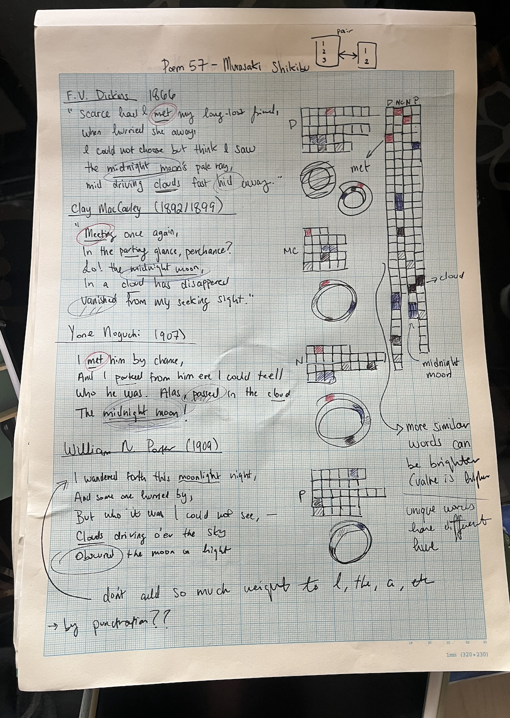
Starting my data analysis on paper with colored pencils, I began to experiment with ways to visualize waka poems discretely. After one particular sketch, I was reminded of a syntenic graph (more on this here) used in genomics and was inspired to recreate a similar one for this project.
Brainstorming how to computationally classify poems
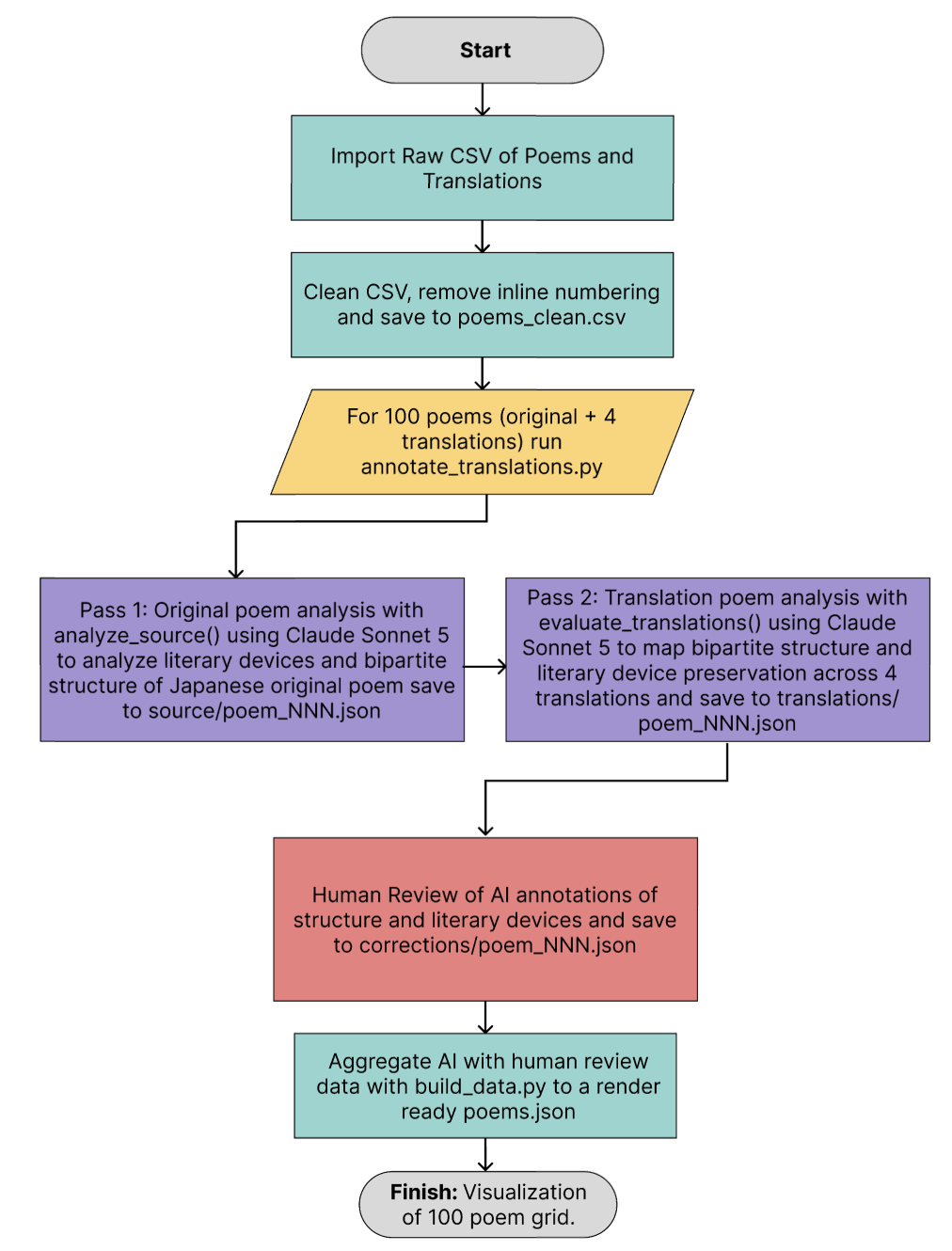
I initially wanted to keep this project scoped to as deterministic of a computational model as possible. After attempting to classify and compare these millenia old poems with tools such as GloVE word embeddings, I learned that this would not be a reliable method of classification. I then pivoted to working with AI endpoints with thorough human spotchecking.
Finalizing the Pipeline and Annotation Scheme
After attempting various methods, a first pass AI, second pass human was determined to be the most reliable. Each poem was annotated by an AI model for structural divisions and literary devices, then reviewed and corrected by a trained Japanese-English translator (thank you mom!) to catch errors and resolve ambiguous cases.
Building the Site
Designs for the site were built in Figma, establishing the visual system and layout before any code was written. The engineering was done in Claude Code and reviewed by myself.
Know Your Flights
An interactive data dashboard to analyze and understand flight delay patterns depending on route, seasonality, and carrier. Using ~69 million flights between 2018–2026, provided from the Department of Transportation. Personal project.
Visit live site →
Project Background
US flight delay information is freely available through the United States Department of Transportation (DoT), but rarely viewed due to its raw data format and lack of visual information. This is data that can inform travelers' flight decisions (day/time to fly, carrier to trust) but is not shown during the travel planning process.
Project Goal
This project aimed to provide an interface for prospective travelers, aviation enthusiasts, and analysts to better understand the trends in flight data between 2018–2026. This would serve not only as an exploratory data analysis platform, but also, a tool for travelers to reach for when planning future flights. For airline and data analysts, this tool can show systemic trends and possible inefficiencies within domestic aviation.
Process Documentation
Motivating Idea
I've been noticing more flight delays recently. A friend's flight from EWR to SFO being delayed 16 hours in May, 2026. My partner's flight from BOS to SFO, more than 5 hours. My own flight from MSY to EWR, more than 5 hours. What if there was a way to reduce risk of delay prospectively?
Understanding the Problem Space
I looked for available data for flight delay data and immediately found that this was well documented by the DoT and available to the public! I found dashboards analyzing this data on an aggregate scale of airports and airlines, but not looking at historical data on specific routes and times of the day! This was a niche I found.
Exploratory Data Analysis
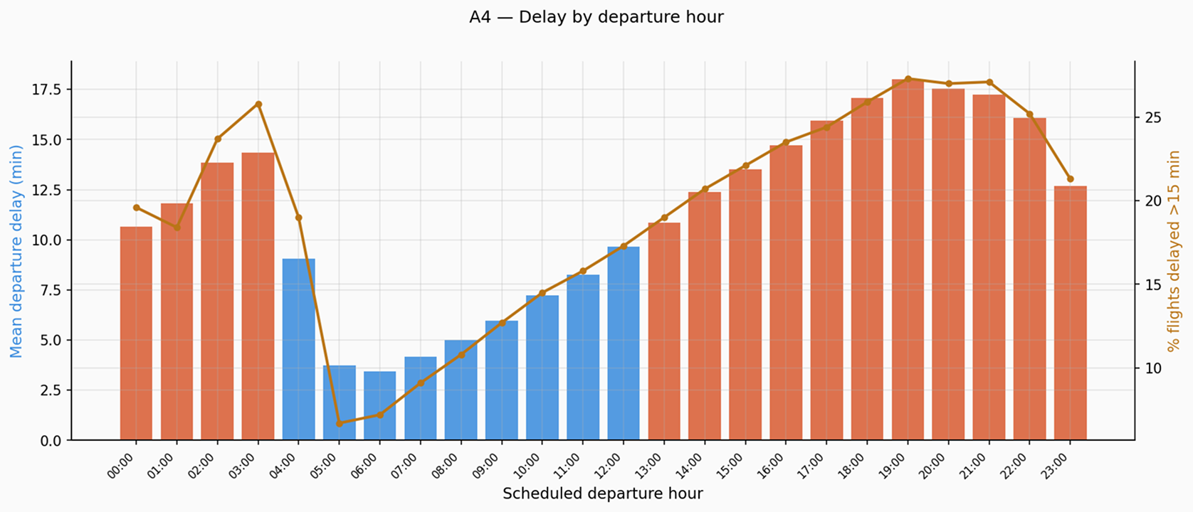
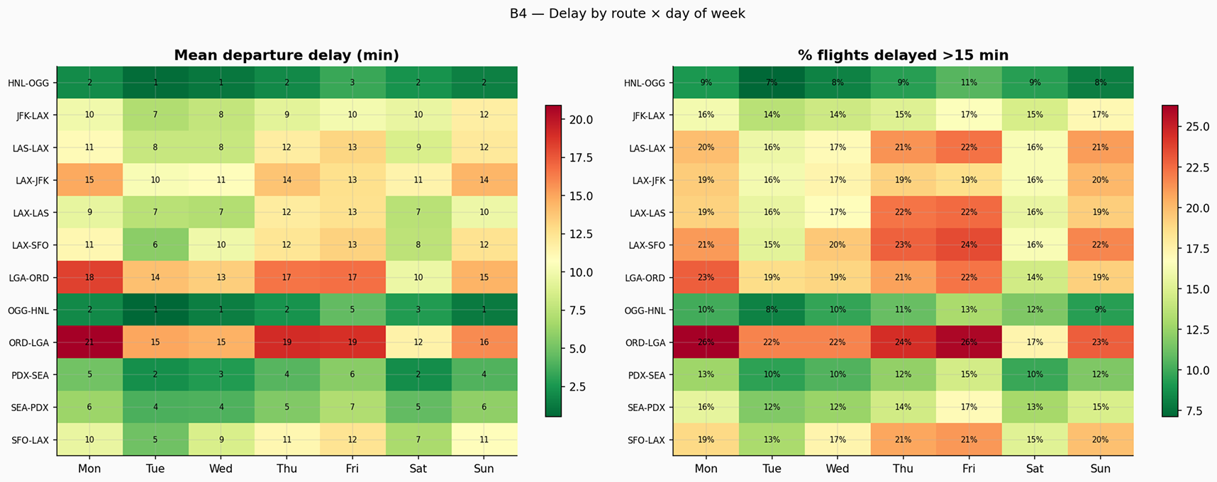
I began with an exploratory data analysis of the dataset with the overarching motivation of "what could I find" and "what would be useful when planning travel?". Immediately, I found trends within the data. Delays were compounding over time of day, with evening leading to the worst delays and early morning, the least. I looked at a few routes, and found that average delay rates and absolute times differed significantly with some performing on time, and other routes suffering an average delay of 20 minutes.
User A:
User A is a traveler planning their trip from New York City to New Orleans. They'd like to know if there is any significant difference in the arrival delays when comparing Saturday and Sunday.
User B:
User B is interested in understanding patterns of travel delays within their airport and the causes for such delays. They find it interesting to understand data patterns.
Defining the User
I defined two prospective users based on the intended uses of my website. User A would be a prospective traveler, and User B, an aviation analyst. I developed their user personas, user journeys, and core questions that would be important to the user.
Determining a Visual Design System
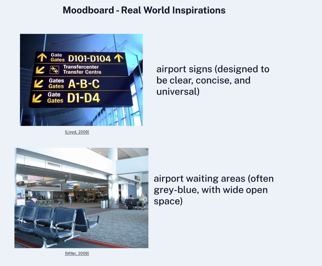
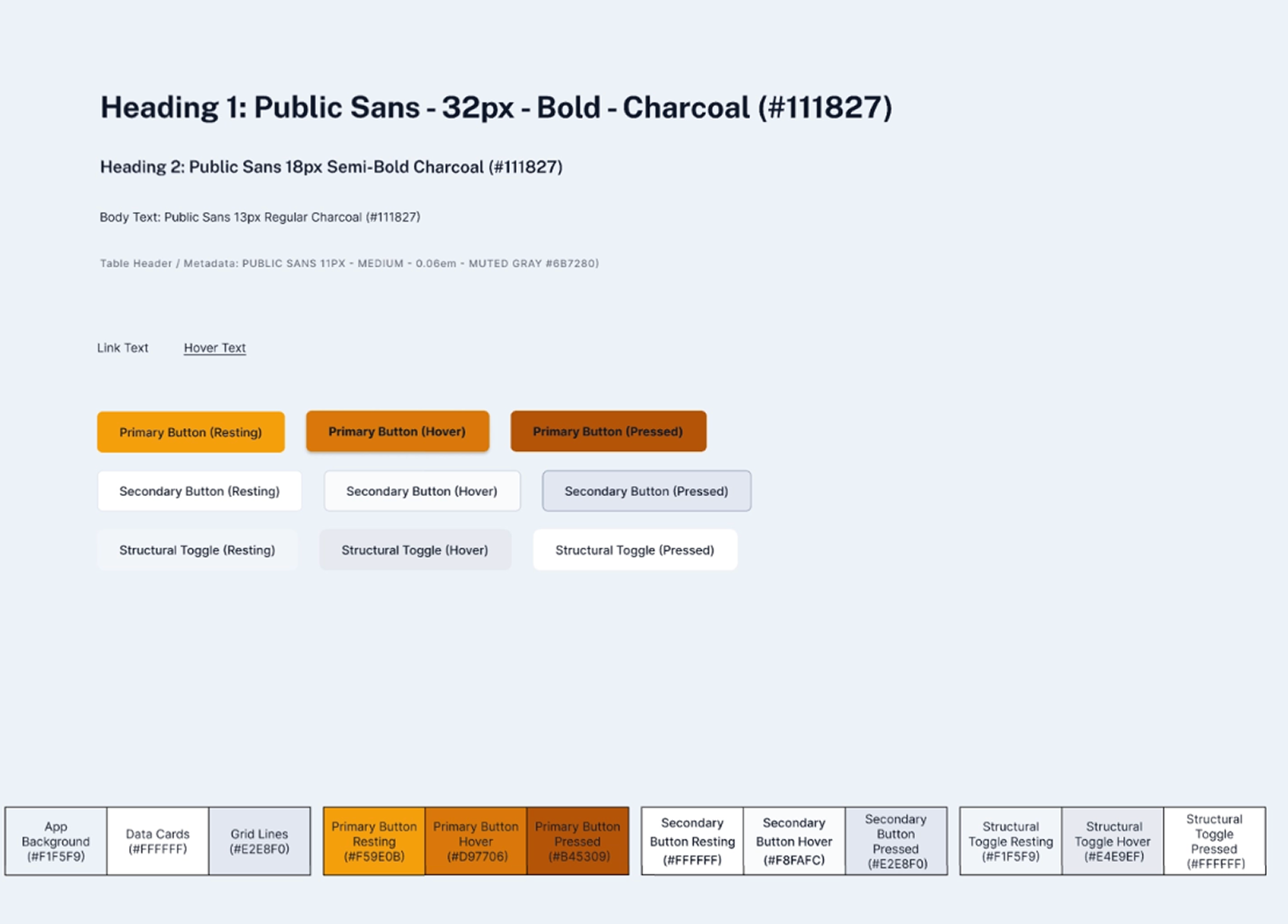
For the visual design of my website, I found inspiration from the real world, looking at the color scheme and signage of airports. I wanted to mimic the yellow-orange of airport signs, and the grey of waiting areas. The typographic style would also focus on simplicity and clarity, similarly to the communicative priorities of airports. I ended up deciding on a largely grey-white background, charcoal text, and a yellow-orange emphasizing color.
Wireframing the Website
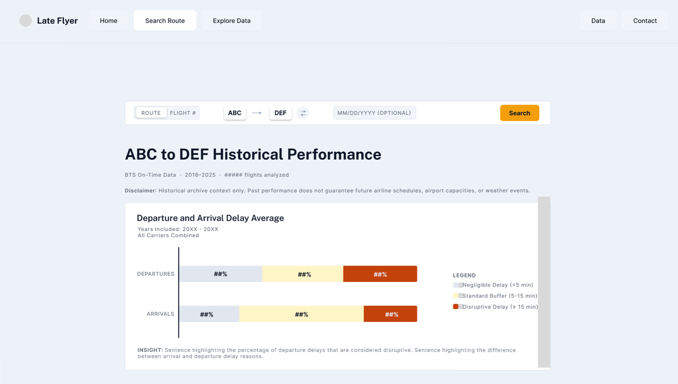
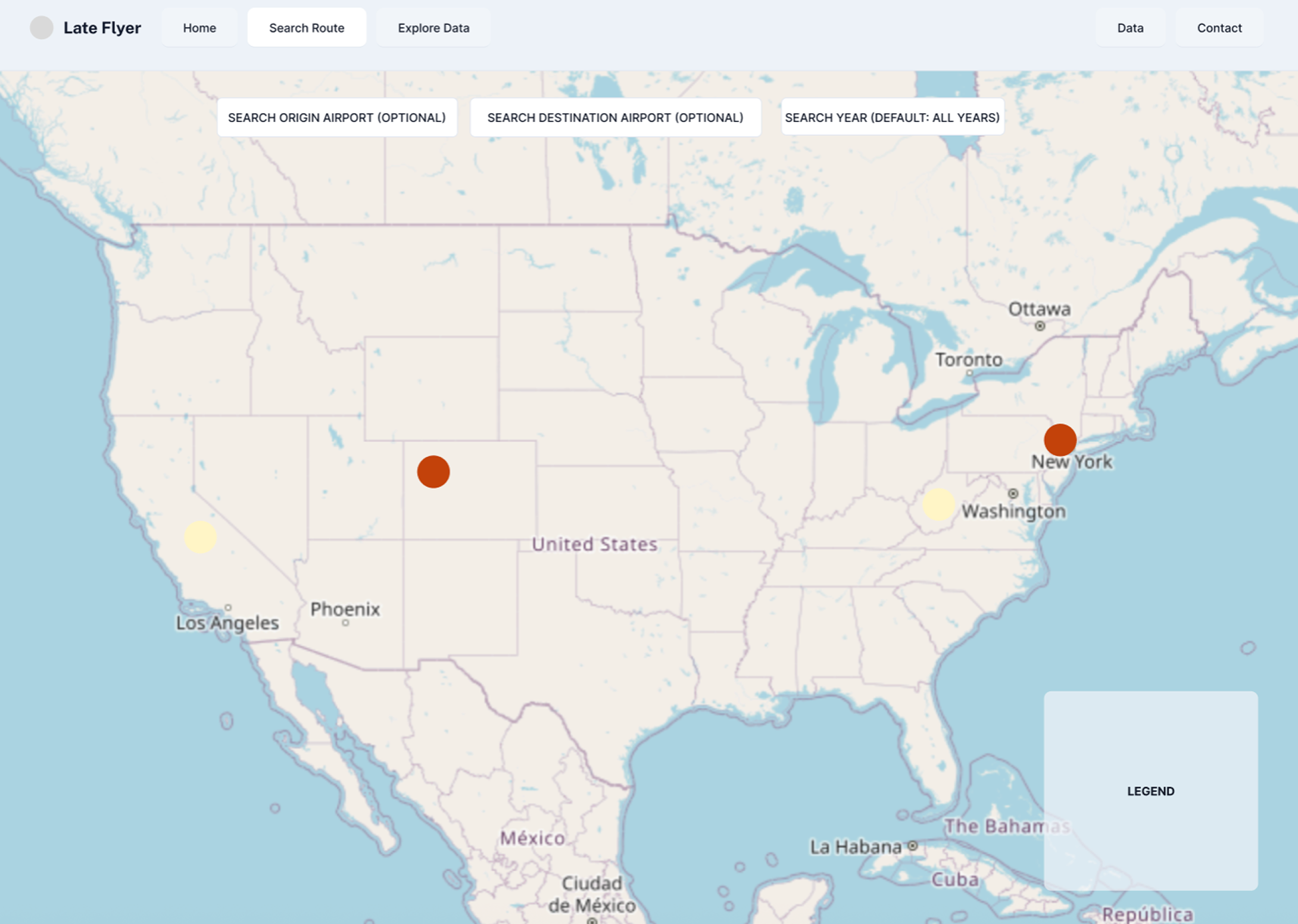
I began on paper with low fidelity wireframing to determine how the website would be laid out, with quick sketches to iterate quickly with the information hierarchy. I then went to Figma to design a responsive and high fidelity wireframe that would inform the final design direction and required data for the site.
Prototyping with Claude Code
At this point, I had a visual design direction for the website, a clear idea of each page, and the information to be presented to the user. I wrote this up as a set of specs with visual aids to detail not only how data should be shown, but how to process it as well. I utilized Claude Code to develop the site. Through this process, I handled ambiguities in my design and refined the output to be clean and useable!
Hyderabad Hues
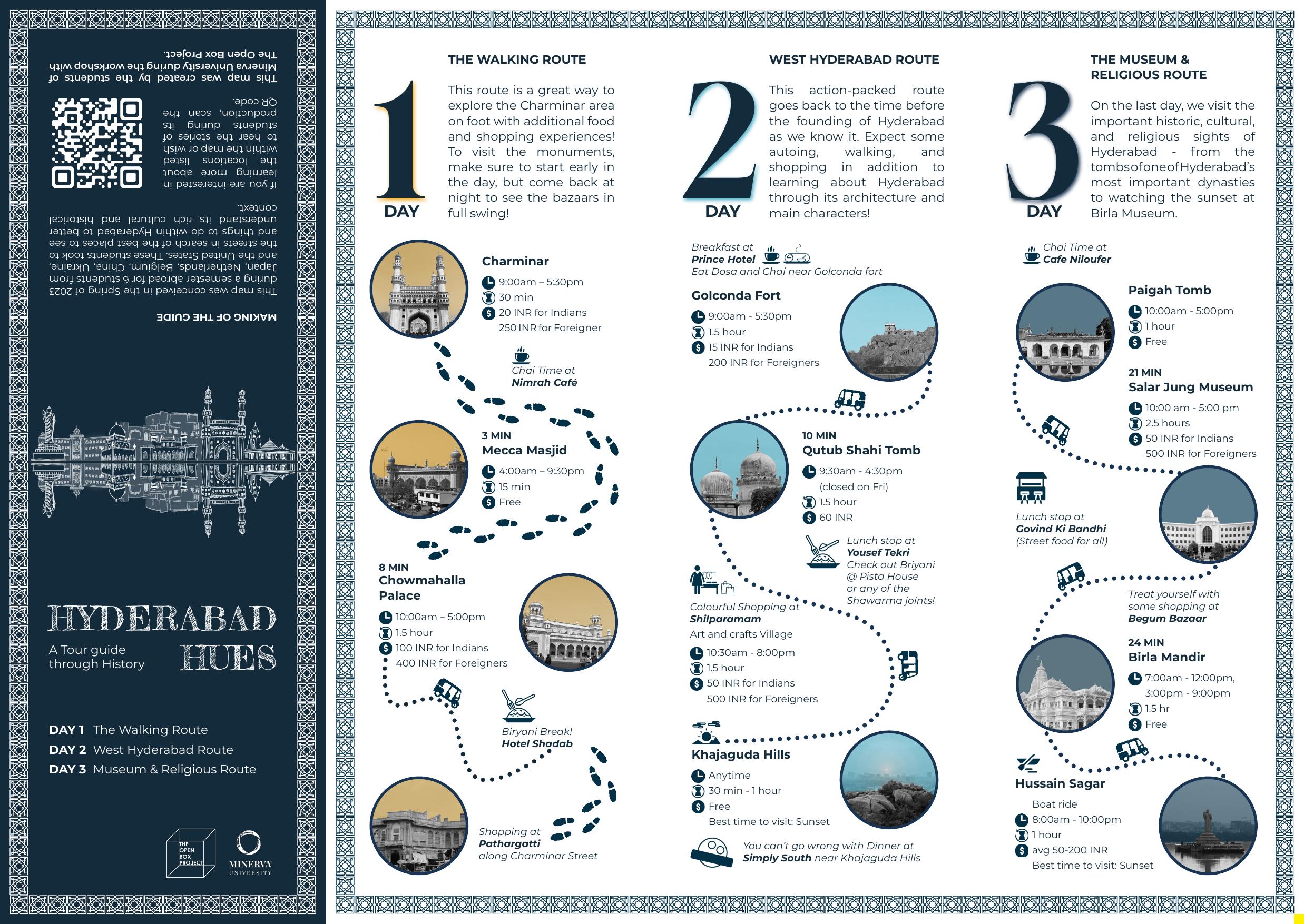
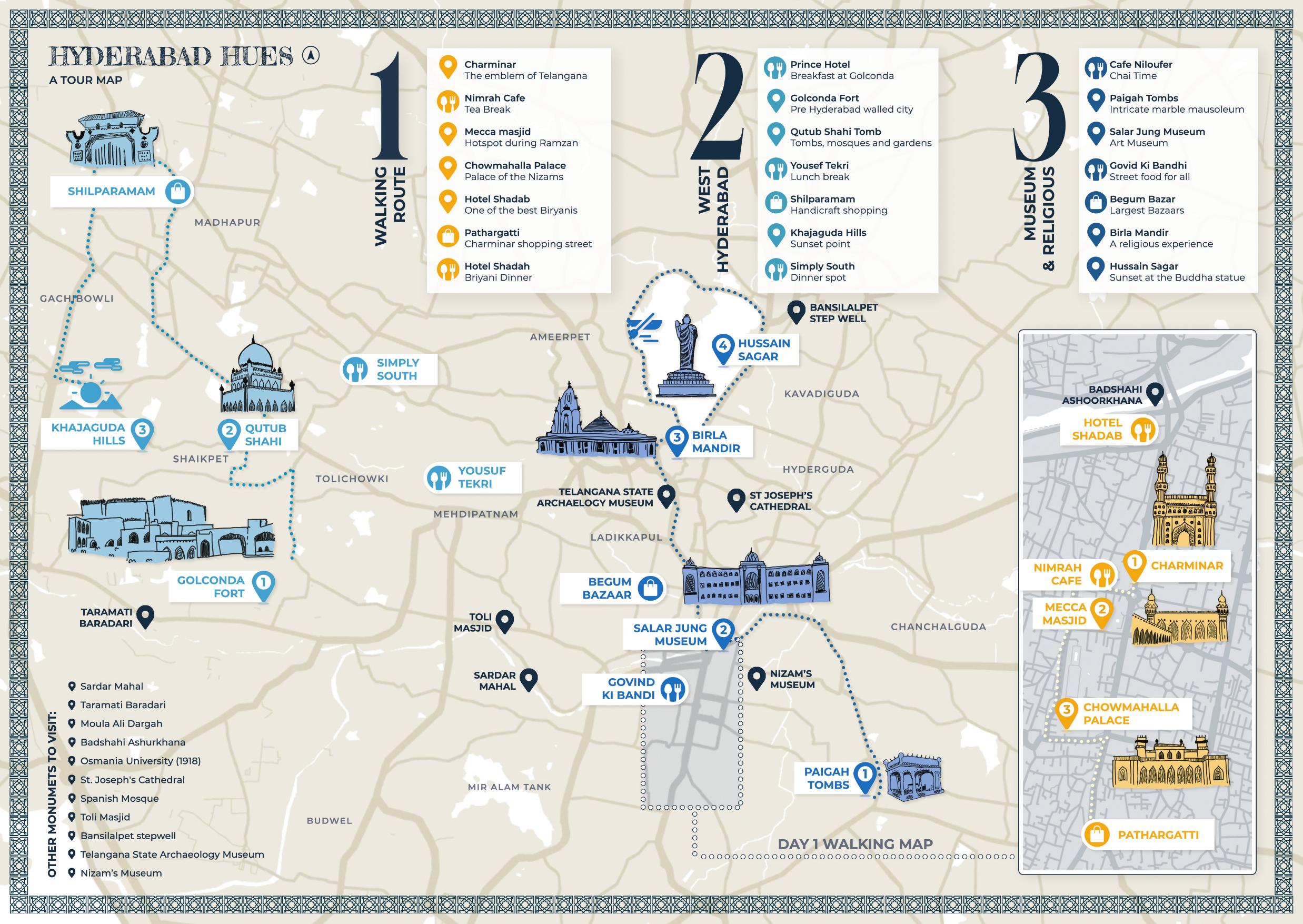
An English historical tourism map spanning 3 days of sights, eats and activities in Hyderabad India. A collaborative project with local architects and students (from Minerva University). 6 person team.
Project Background
Hyderabad, India is a city with vast culture and heritage. It is home to 1000 year old monuments, unique culinary experiences, and interesting shopping. This makes it an ideal city to visit. Despite the appeal of Hyderabad, the city has no usable tourist guide for English speakers. Existing guides were either overwhelming (50 sites, no logic) or too shallow (nice photos, no practical info). In addition, the city is massive and difficult to navigate without guidance.
Project Goal
Help prospective travelers discover the history and current character of Hyderabad with multi-day, research-backed tourism map for english-speaking travelers, informed by locals.
Process Documentation
Motivating Idea
This project was a collaboration between Minerva University and Open Box, a collective of architects, to help them in developing resources for travelers to discover the city beyond its superficial layer. As longer-term travelers ourselves, we were the appropriate candidate to attempt to learn the history and culture of the city and curate a set of experiences for the next traveler.
Understanding the End Outcome
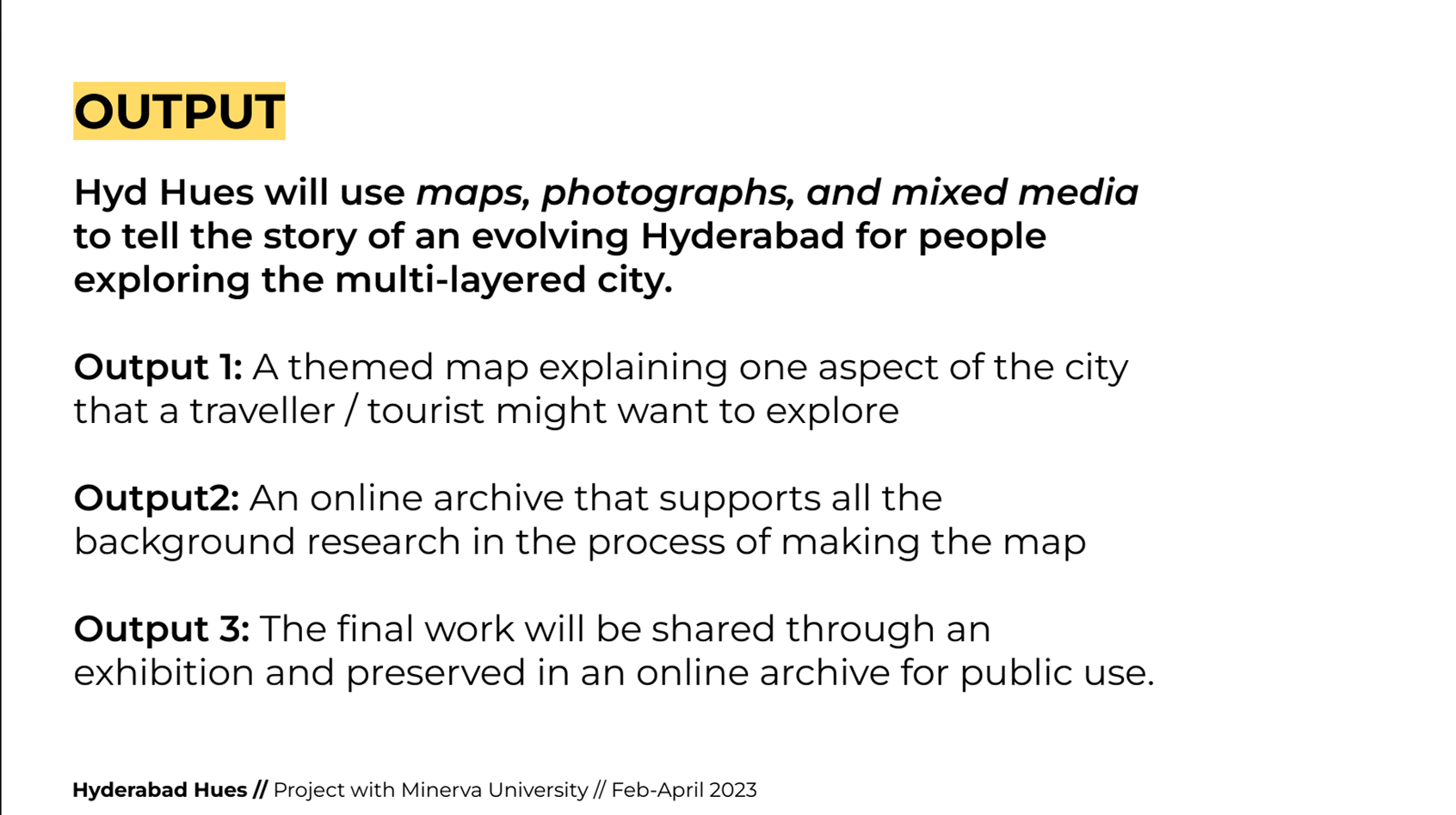
This project had a clear set of outcomes. A map, an online archive, and an exhibition.
Timeline
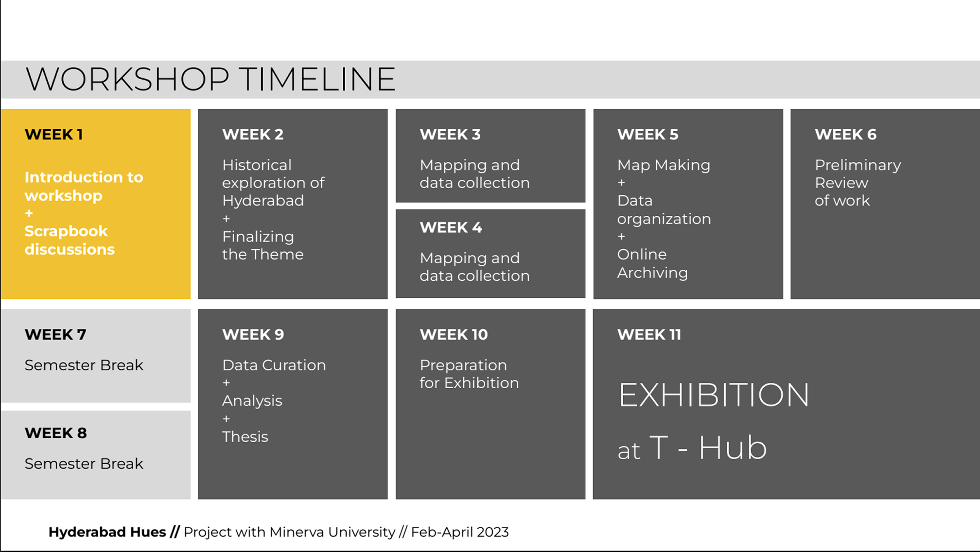
In order to meet all three outcomes, we were given a clear set of goals for each week. We begun with narrowing the scope of a map to make and focusing in on a theme. We then would collect data through going out into the city and trying various routes. In the following weeks, we would review the data and create a draft map and archive.

Determining a Map Direction
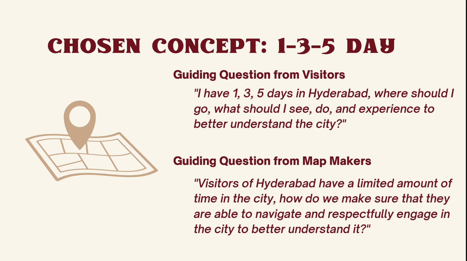
Our team quickly honed in on the traditional 1-3-5 day tourism map, which provides helpful routes to follow for 1, 3, or 5 days in the city, with all stops included.
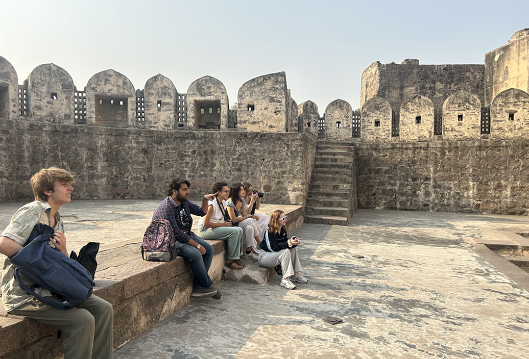
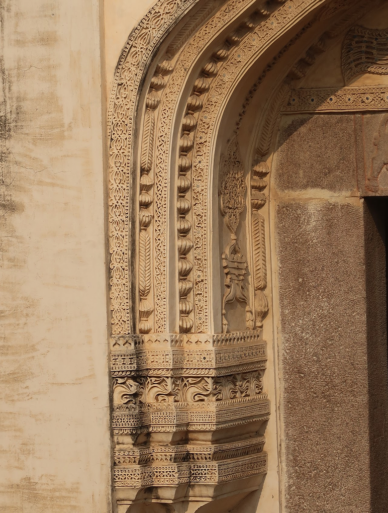
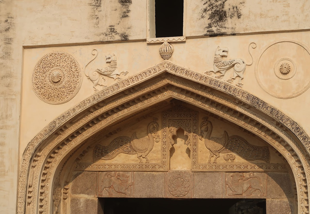
Data and Story Collection
Several weeks were spent visiting various sights, drawing quick sketches, and learning about the history of the place with a local historian.
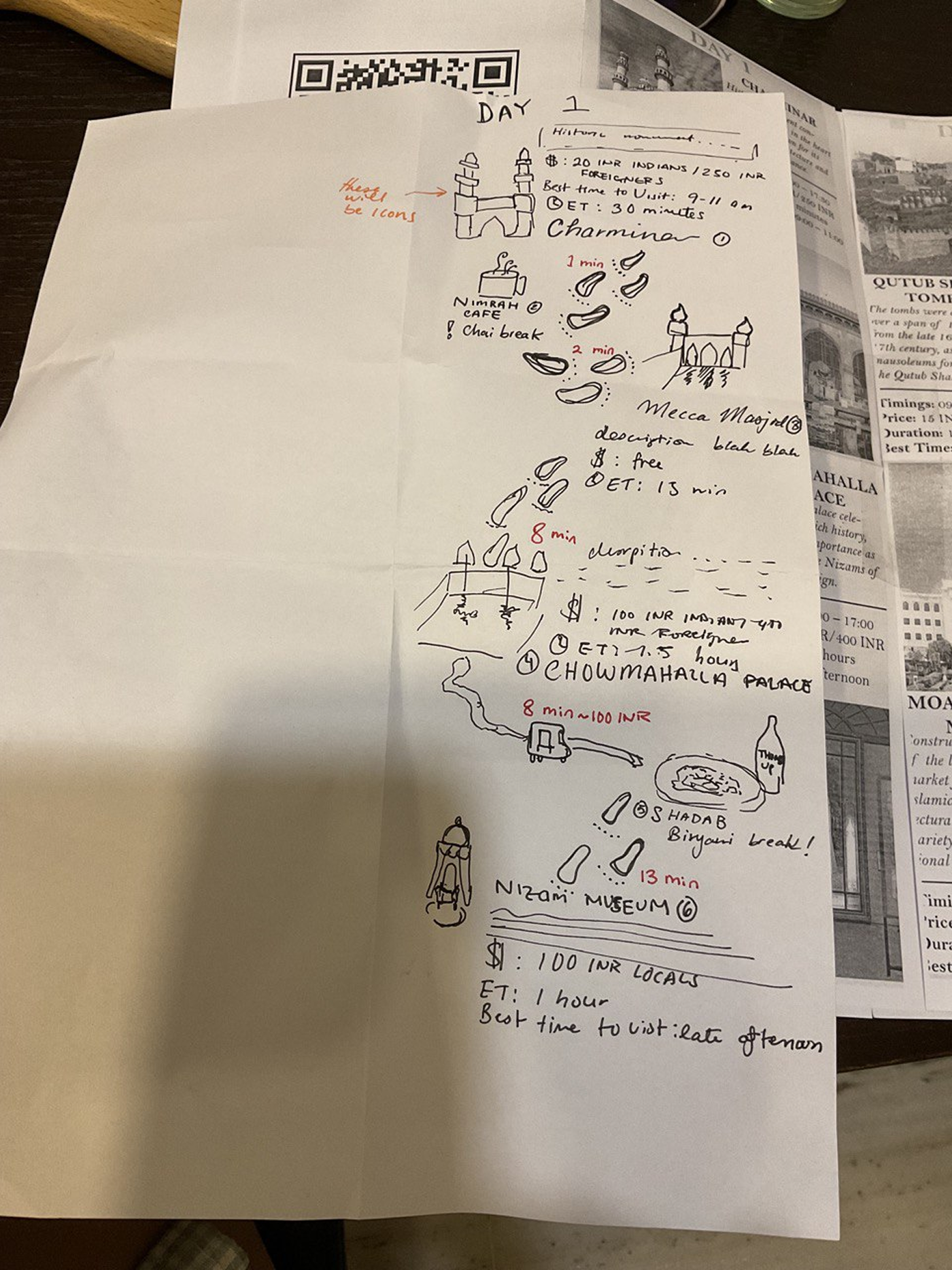
Mapping Workshop
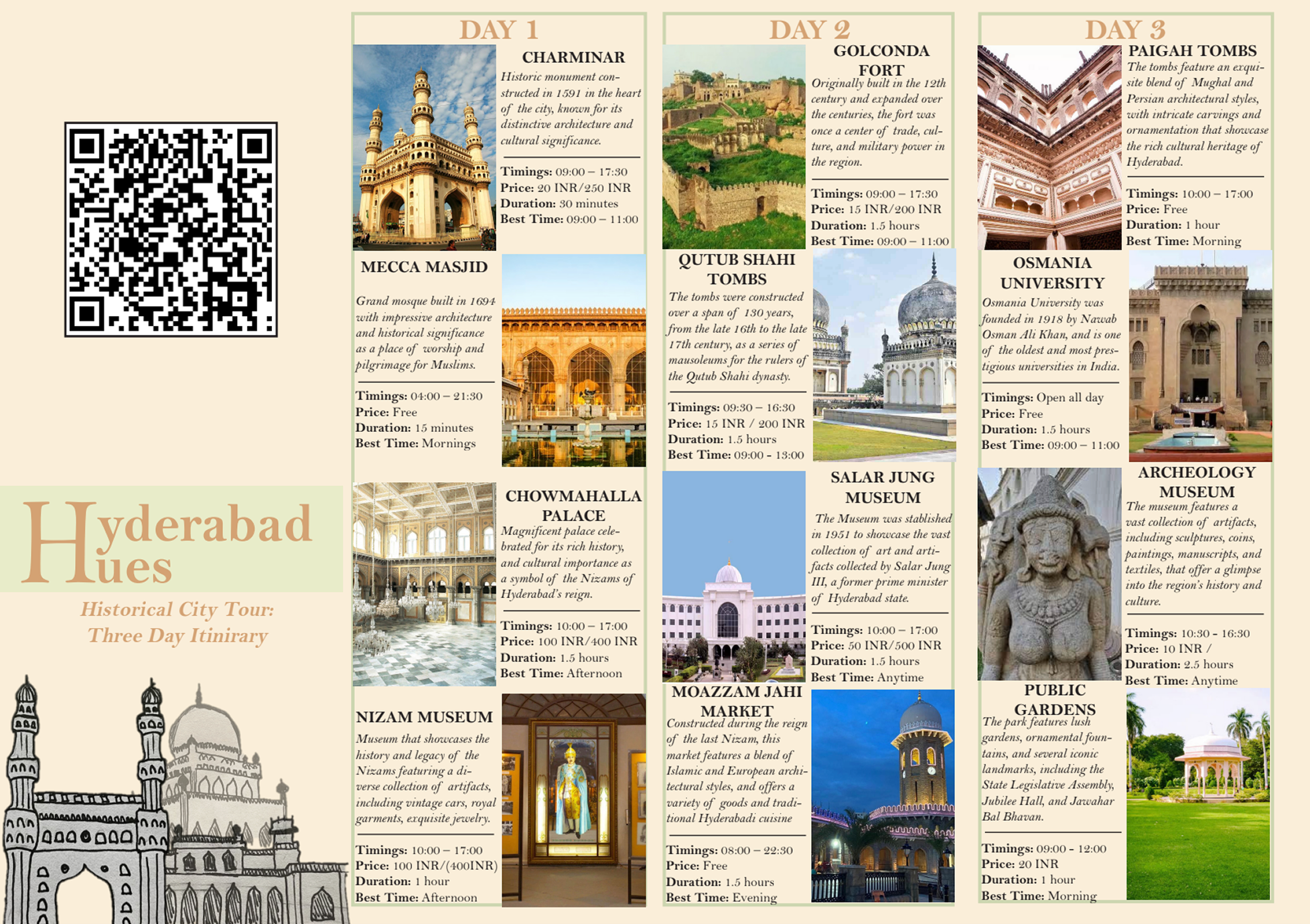
The first stage of the process started on paper. We had workshopped the layout of the map and finalized the size, folding, and components of the map (a 3-day itinerary structure).
Drafting in InDesign
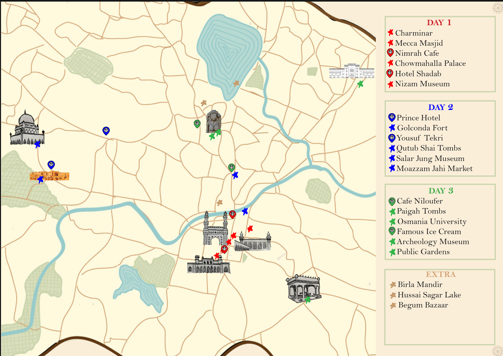
After a paper prototype, Anousha, one of the architects from the Open Box Project, drafted a digital version of the map in Adobe InDesign. This would go through more iteration between the two teams before becoming exhibition ready.
Online Archiving
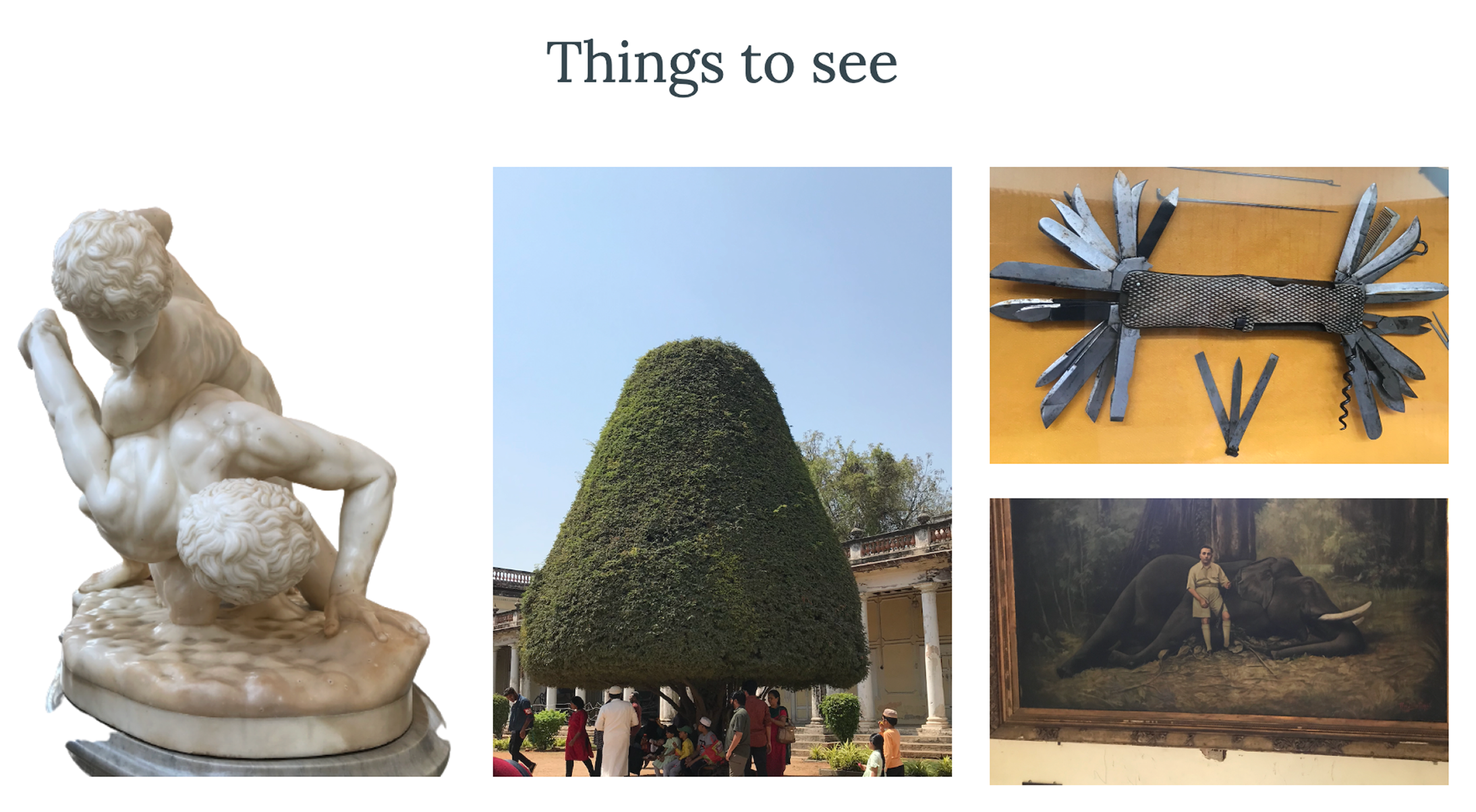
In tandem to the map drafting, we began to develop out an online archive filled with photos, quotes, and general information. You can see the archive here.
Final Map, Archive, and Exhibition
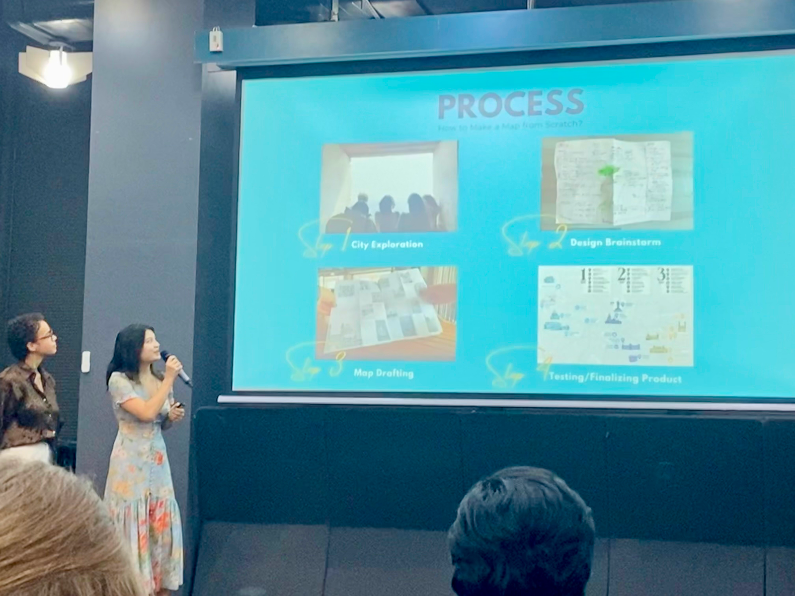
After completing the archive and the map, we presented these findings in an exhibition in Hyderabad.
Mind the (mobility) gap!
Developing a research methodology for the use of open street view imagery to complement community survey data-based identification of transit deserts (areas lacking mobility and transit options).
Project Background
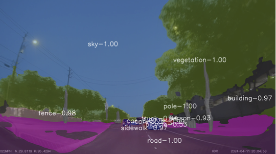
Urban mobility shapes socioeconomic equity, yet transit accessibility remains uneven. Existing research, focused on data-rich US cities, often overlooks ground-level barriers and indicators of mobility. This study integrates visual data analysis to provide a more context-aware approach to transit desert identification.
Project Goal
This project proposes a novel method to improve fine-grained transit desert identification by integrating Street View Imagery (SVI) and Computer Vision (CV) to capture spatial and infrastructural nuances often overlooked in traditional census- and transit-schedule-based methods. By leveraging SVI-informed deep learning, this study explores a scalable, fine-grained approach to transit accessibility analysis, particularly in data-limited regions.
Process Documentation
Motivating Idea
Inspired by a summer of transportation and equity research at the University of Florida, I became interested in the use of Street View Imagery data to catalogue urban mobility issues. I decided to extend upon Dr. Jiao's research on "transit deserts", which utilized community survey data and general transit feed data to identify areas with inadequate public transportation.
Building a data pipeline
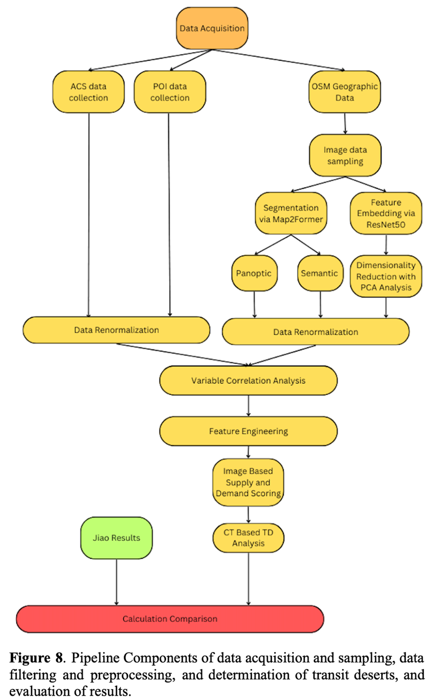
This project integrated both community survey data and image data, requiring a careful sampling, cleaning, and machine learning pipeline. The overview of the pipeline is shown to the left.
Sampling
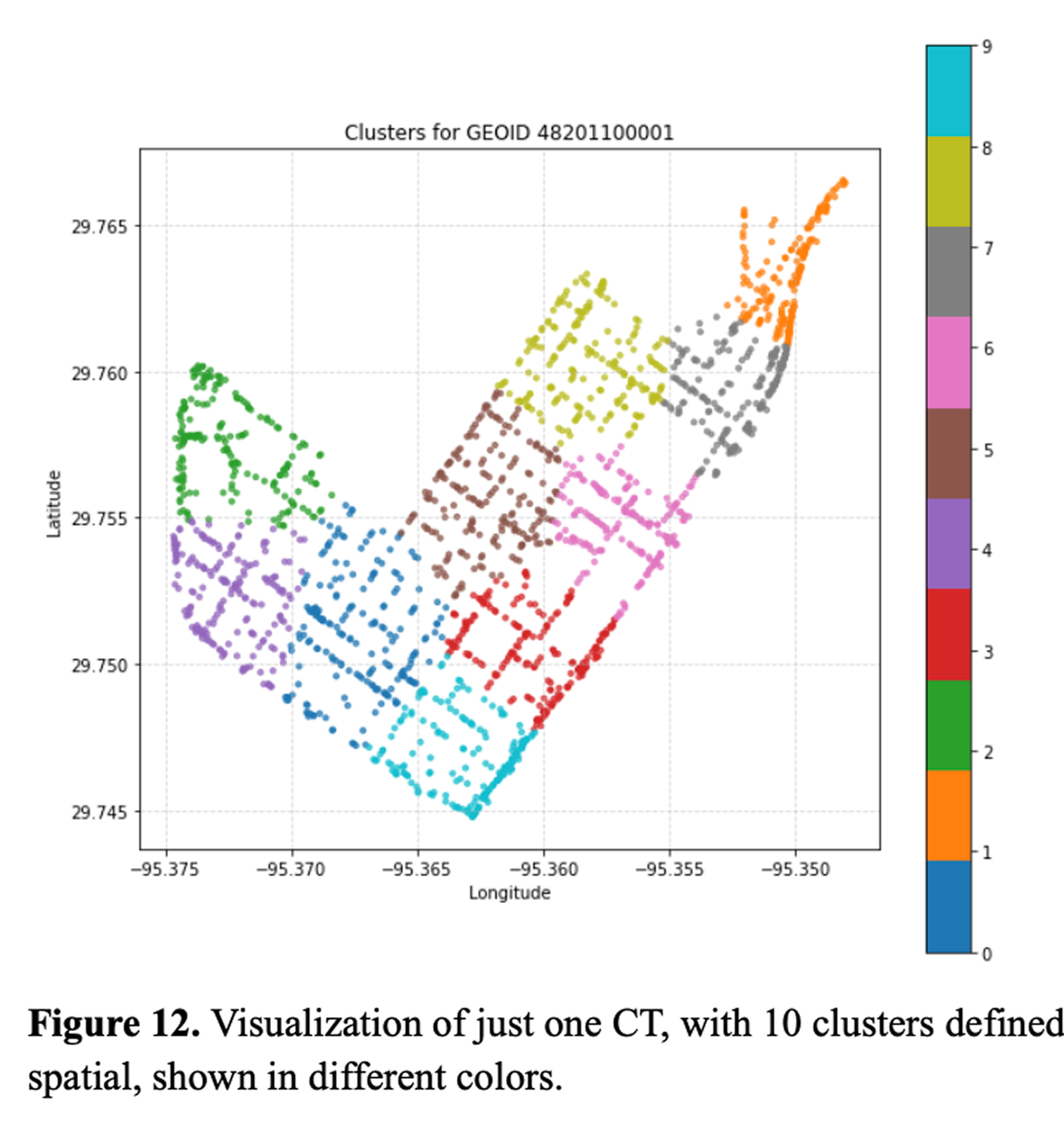
Through Mapillary, a free SVI platform alternative to Google Street Maps, I sampled 50,000+ images from Houston's roadmap.
Image Segmentation
For segmentation, I used Mask2Former (Cheng et al., 2022) as my primary segmentation model, implemented through ZenSVI (Ito et al., 2024) and trained on the Mapillary Cityscapes dataset to find 19 urban classes. This allowed me to segment both panoptic and semantically.
ACS to Image Correlation Analysis
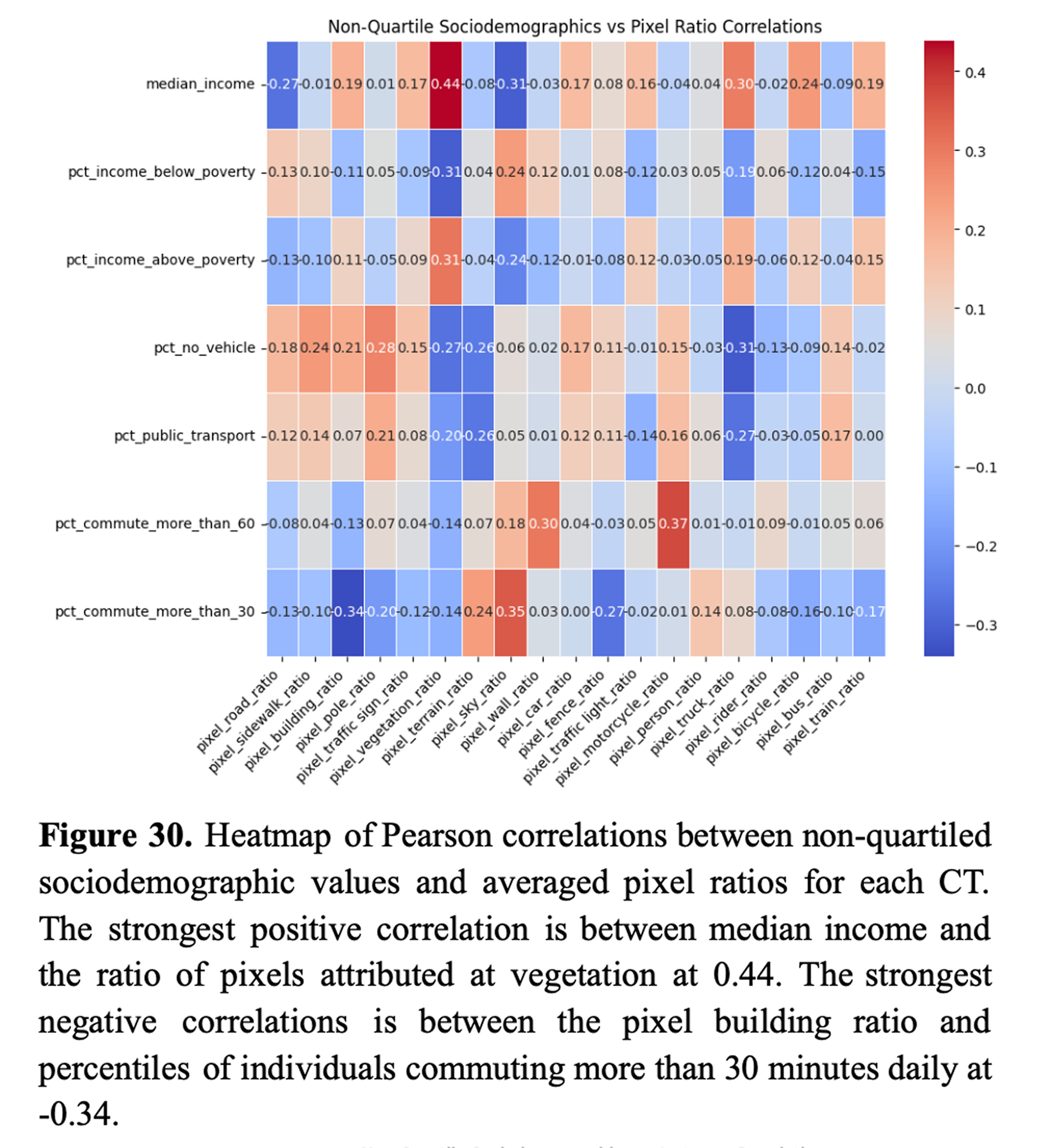
To compare two types of data — ACS and photographic — I ran various correlation analyses to see if there was a significant correlation between any survey measurements for a given geography and the "on-the-ground" view. An obvious negative correlation was between building pixel ratio and percentiles of individuals commuting more than 30 minutes daily (r = −0.34). Other correlations were more curious, such as between median income and vegetation (r = 0.44).
Building a new transit desert index model
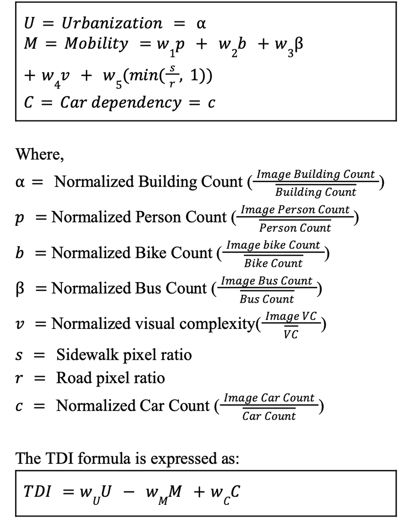
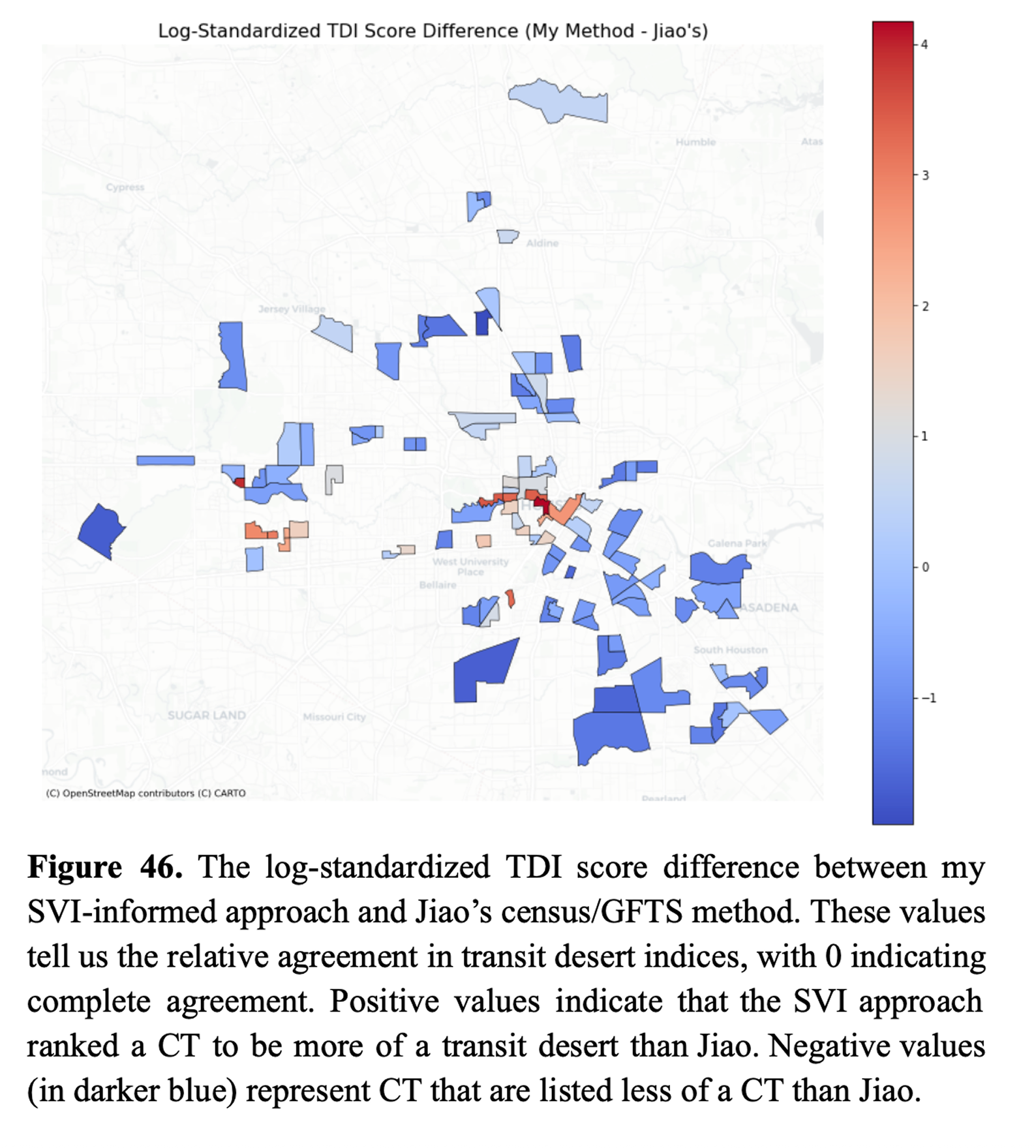
Considering the most latent features that would represent mobility — such as bike and bus prevalence, sidewalks — I built a model to define a transit desert and compared my results with that of Jiao.
Sensitivity Analysis of Model
A model is, of course, not representative of reality and subject to bias. I ran a sensitivity analysis to understand how this model would change over various values.
Final Paper!
Having built a data pipeline, ran exploratory data analysis, built and evaluated a new model for TDI, my paper was complete. You may view the whole paper here.